As it turns out, 2013 was a pretty solid year for rebranding (especially when compared to 2012).
Still, some rebrands managed to bonehead their way to stardom and here-within are my picks for the three worst rebrands of 2013.
3. Yahoo!:
If ever there was a company in need of a rebranding in 2013, Yahoo was it.
Once the über cool poster child for the bustling internet scene, Yahoo has become an aged, virtually irrelevant tech brand. With public opinion and stock prices dropping, Yahoo made its last-ditch effort to save the company by acquiring Google alumna, Marissa Mayer as its messiah CEO in 2012.
Under Mayer, Yahoo stockpiled 23 startups in 2013, including Qwiki, Xobni, and the microblogging platform and social networking website, Tumblr. Yahoo also struck up a licensing deal to stream SNL, and it completely overhauled its photo service Flickr, all in an attempt to reconnect with the younger demographic.
Then in the late summer of 2013, Yahoo announced the visual update to the brand—a new logo was soon to come. But instead of unveiling one logo as most brands would, Yahoo thought it would be hip and edgy to unveil 30 logos over the course of 30 consecutive days. On the 31st day it would choose the winning design to move forward with.
Unfortunately the new uninspired logo disappointed anyone who gave a shit.
While it was an improvement from the dated original, there was nothing about the new identity to fortify Yahoo’s innovation prowess. In my opinion, the excessive hype was a big gamble and big mistake, as it pushed the new logo into an arena where only a home run would suffice. The idiotic logo bake-off of 2013 was a classic case of over-promising and under-delivering, and it’s for this reason Yahoo comes in at #3 on my list. While Mayer is proving she has a killer long-term business strategy focused on building Yahoo into an essential mobile device fixture, the visual aspects of the brand strategy simply aren’t in alignment with where this brand is going. In 2014, will you Yahoo?
2. EY (Formerly Ernst & Young):
When CEO, Mark Weinberger took the helm of Ernst & Young in 2013, rebranding the firm might have seemed like a cool idea.

In July 2013, the iconic Ernst & Young name was shortened to its initials, EY. Weinberger provided rationale for the change in a press release announcing the rebrand, “Shortening our name will provide consistency and ease of use for EY practices and clients around the world.”
Of course with the name change, the prosaic Ernst & Young logo was also turfed, replaced by a bolder two letter monogram designed by London brand consultants, BrandPie.

The only element that was kept from Ernst & Young’s original design system was its beacon of light, which was retained to mark the forward looking firm.
While I believe Weinberger’s rationale was silly and weak, I’m going to give him the benefit of the doubt. At least there was some rationale. Too many companies re-logo themselves under the guise of a rebrand without giving it any thought.
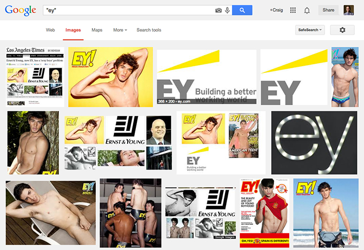
Having said that, this is where the rationale stops and any semblance of a strategy completely falls apart. You see, long before Ernst & Young ever considered the notion to abbreviate its name, EY! had existed for five years as a popular gay men’s magazine.
EY! (a.k.a. Electric Youth) magazine features pretty boys in thongs only Sisqo could be proud of. And from what I’ve learned through my research, EY! is as cool as it gets when it comes to gay soft porn.
Wouldn’t one expect the world’s biggest audit firm to, um…audit the EY brand name prior to beginning a major rebranding?
I understand opening Google on your desktop, typing “EY” into the search bar, and observing what pops up is hard work—but come on. Had any one person at Ernst & Young or BrandPie actually completed an EY name search they would have very quickly realized the search results are dominated by images of EY!’s models.

So now, not one—but two big branding issues exist.
For EY the audit firm, it calls into question its auditing practices. Will this gaffe negatively impact its audience’s perceptions of the brand and the quality of the work? Maybe. Also, the web is now replete with news stories such as, “Ernst & Young Accidentally Rebrands Itself as Porn." Such attention has, and will only serve to make any future marketing efforts extremely conservative. Probably not the direction Weinberger was hoping to take the brand.
As for EY! the magazine, it now also faces brand confusion as it’s potentially being seen as pimping overweight, grey-haired heteros in business suits.
Oops.
1. JCPenney (The brand formerly known as Prince, jcp, and JCPenney):
Owning the top spot for 2013’s Worst Rebrands is JCPenney.
What a train wreck. The JCPenney brand debacle continues to baffle and entertain me with its blatant absence of any strategic thinking.

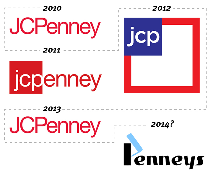
JCPenney moved up one spot from 2012’s Worst Rebrands not because it reverted back to its logo of 2010, but because in the span of three years, JCPenney has completely mismanaged its brand to the point of having to issue a 30-second televised apology.
JCPenney, it’s time you get your shit together.
Seriously. I understand you’re trying hard to stay relevant but returning to the old image is a step in the wrong direction.
What will we see in 2014 from these characters? I’m not sure, but if history has any say (and future has a good sense of humour), we should expect the brand continue to “evolve" by dropping the JC from its name. Simply to be known as Penneys.
What lessons can be learned from 2013?
Lesson 3: Glimpse into the future (or at very least, the present).
A new brand identity should visually mark where your brand is going, not where it is; otherwise it’s already outdated. None of 2013’s winning losers have pushed the envelope with their rebranding efforts. There is nothing that looks or feels new.
Lesson 2: Look outside (just as deep as you look inside).
Clearly these branding exercises didn’t involve a review of competitive brands. Failing to do so immediately doomed them to incremental improvements at best. If a company aspires to be known as having the best brand in its industry it should raise the bar and compare itself to bigger/better brands.
Lesson 1: Rebrand with substance.
A logo should only change to reflect a substantive change in brand and business strategy. A new brand does not a new logo make.
What do you think?
Did I get it right? Was there another brand that should have made the list instead? I’d love to hear from you.
Content references and image sources: http://www.underconsideration.com/, http://www.marketingweek.co.uk/


