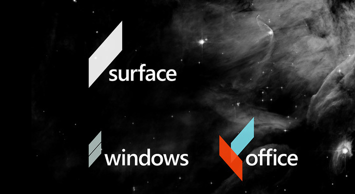
One of the most exciting things I’ve followed in the wake of Microsoft’s rebranding debacle is the work of a student named Andrew Kim.
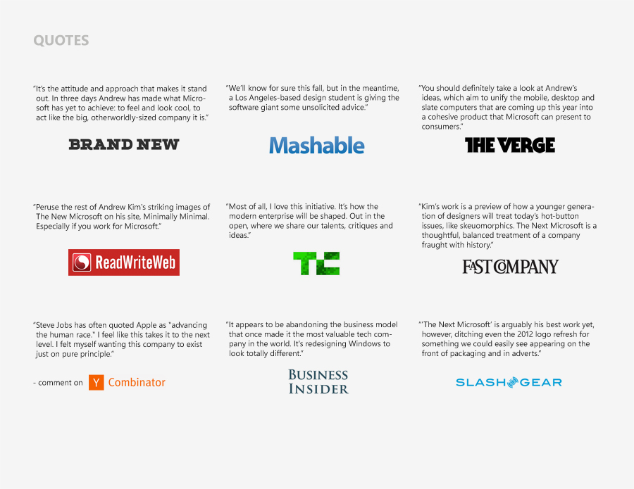
Kim’s re-imagining of the identity as a complete and interconnected rebranding effort is stellar. In fact, it was so well-received by the business, marketing, and design communities that it went viral in days.
In his analysis of “the big three,” Apple, Google, and Microsoft, the Microsoft brand was outdated, slow, corporate, and conservative in comparison.
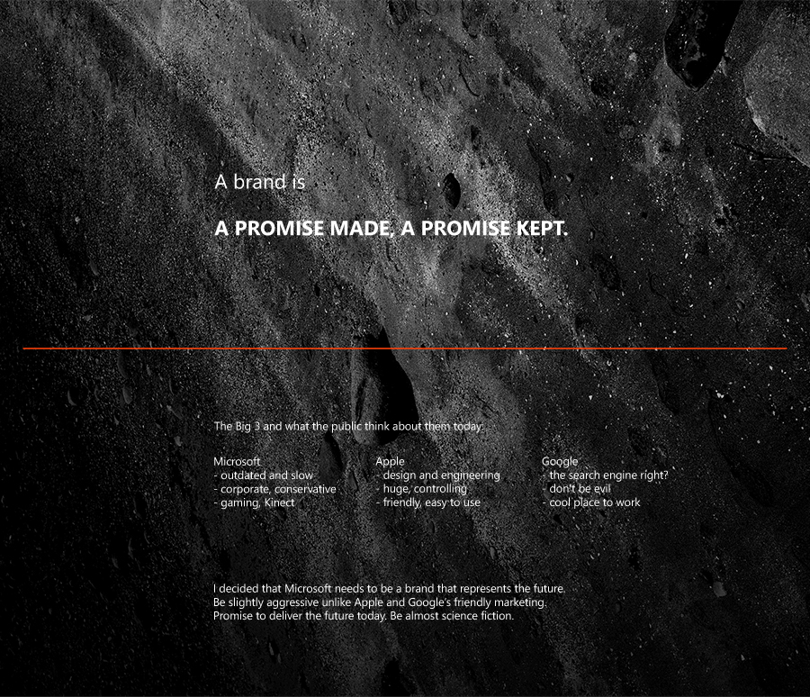
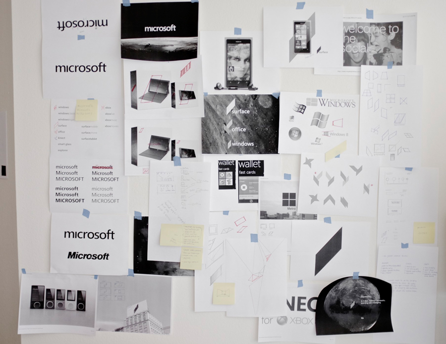
Kim decided that Microsoft needs to become a brand representing the future.
One that promises to deliver the future today. With this positioning strategy in mind, his concepts take on a slightly aggressive, science-fiction-like approach, unlike Apple’s and Google’s friendly approaches.

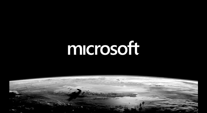
Kim’s proposed redesign changes the typeface to an uncapitalized sans-serif, with well-adjusted kerning.
He conceives a “new start” for Microsoft with a visual identity seizing outer space imagery in mysterious black and white, which is a stark contrast to Apple’s and Google’s colourful identities.
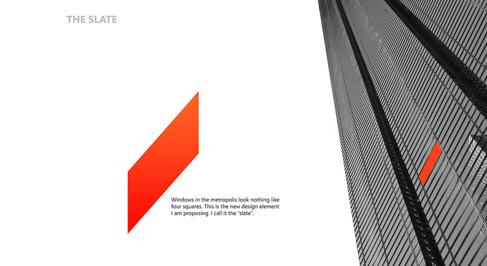
The centrepiece of Kim’s proposal is the new icon, which he calls “the slate.”
The slate icon is inspired by the oblique perspective of windows in corporate office towers.
Adapting the slate for the company’s many product lines, from tablets to software, shows its flexibility.
![]()
Meanwhile, a super-sized version of the slate becomes a window pane.
Like Microsoft’s past logos, it can be super-sized to frame imagery such as mountain landscapes, crowded city streets, and cityscapes. I find the cityscape concept especially interesting because it can localize any ad campaign in the world.
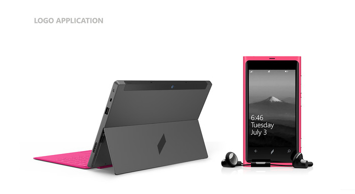
Stamped on a Surface tablet and Windows phone, the slate is a less “busy” visual identity.
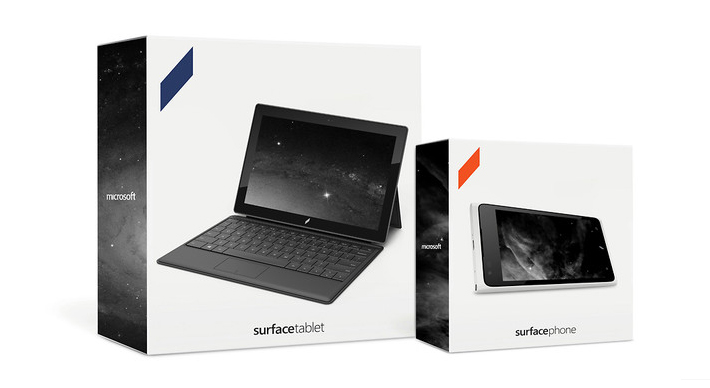 Which also extends to Microsoft’s packaging.
Above, two boxes for the company’s newly-unveiled line of tablets.

Kim demonstrates that the slate could be a ubiquitous presence in the multi-armed corporation, fading into the background at any scale.
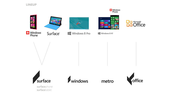
Again, we see how Kim imagines the new logo adapting to Microsoft’s various brand families.
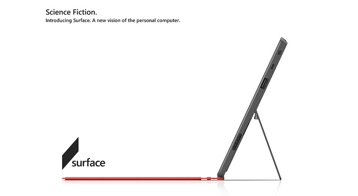
He’s even reimagined print ads.
Above, we see a full-page spread (or billboard) for the Surface tablet.
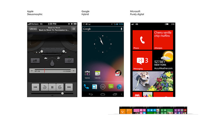 Finally, Kim explains the positioning through the visual differences of Apple, Google, and Windows UI (User Interfaces). On the above left, Apple’s interfaces rely heavily on “skeuomorphics,” or design details that make it seem old, worn, and familiar. On the far right, Microsoft is the opposite, with a purely digital interface. In the middle, Google is somewhere in between.
Kim sees his proposal as a way to make good on the company’s history as an innovator. “Microsoft: A promise made, a promise kept.”
As a branding guy I am completely enamoured with Kim’s work.
It’s nothing short of brilliant. It could have been (and I suppose it still could be) a “game changer” in repositioning Microsoft.
If I was one of the execs at Microsoft I’d eat some humble pie, chalk the current rebranding effort as a cost of doing business, buy the concepts from Kim, and hire him to complete the rebrand for its entire brand family…unencumbered by committees of course.
Content and image sources:
Fast Co. Design.
Worst Rebrands of 2012


