Talk about disasters. This year saw a number of well-known brands attempting to “rebrand” themselves and ending up with results that, unfortunately, give branding—and rebranding—a bad name.
2012 set a new standard for brand stupidity.
The disasters outlined below are not examples of real rebranding. They are attempts to update the company’s image, which is called “refreshing.” Design for vanity’s sake.
This post discusses the horribly flawed logo refreshes and provides some insights into the fragmented and incomplete brand strategies behind them.
So which companies failed the worst?
Winner: Gap
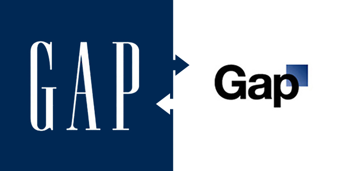
The most absurd attempt to update a brand identity in 2012 was made by Gap. After only eight days of public ridicule, Gap reversed its soft rollout and went back to its original iconic logo.

GAP has clearly lost its way.
No vision. No sense of self. How else can you explain this mishap? So embarrassing.
Second: JC Penney
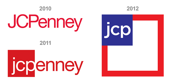
The situation can’t be good when you announce your third “rebranding” project in three years. You know the situation’s even worse when Forbes Magazine calls your latest effort an “epic failure.” Yikes.

Why does JC Penney feel it needs to keep reinventing itself?
This is what happens when your entire strategy and market position is built on lowest price. When your promise to consumers is the lowest price, you literally have nowhere to go but down.
Furthermore, once you’ve positioned yourself as the bargain brand, you can’t expect to reposition yourself still as a bargain brand but with newer, higher prices. You’ve broken your promise, and your customers won’t stand for it. And they’ll show you by taking their business elsewhere. (I’m not sure what the most recent statistics are, but earlier this year I read that JCP’s sales dropped nearly 20%.)
Third: Arby’s
Oh Arby’s. Poor, poor Arby’s.
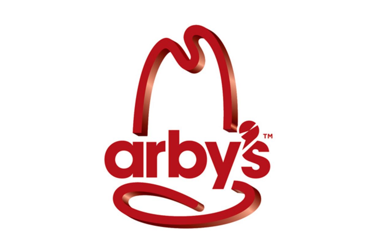
In October 2012, Arby’s unveiled one of the most depressing examples of a logo update I’ve ever seen. First, it used an outdated typeface. Second, it chose a weak lowercase “a” for the name. (Will the macho male ever be able to relate to this new soft lettering? Only time will tell.) Third, its redesigned apostrophe is confusing at best. And finally, its 3-D rendering of the 10-gallon hat is abysmal. Does the 3-D effect serve any purpose whatsoever? Was it designed on whimsy?

This logo was so poorly executed that Armin Vit from the esteemed branding blog, Brand New joined in the public beat-down, saying, “The new logo retains the hat shape, along with some unfortunate 3D extrusion, but replaces the typography with some flavorless, sans serif with a lowercase “a” and the sharpest, biggest (and is that shiniest?) apostrophe that no logo ever needed.”
Are these minor details? Perhaps to most people, yes. But to someone like me who thinks about branding every day, I see this as a company more concerned with looking cool than it is with delivering tasty hot sangwiches. I believe it begs the question, if Arby’s leaders are not concerned with the minor details of its highly public image, would this lack of concern translate to the not-so-public details of preparing its food? Maybe. Maybe not.
Sorry, but I don’t like betting on maybes.
Runner Up: Microsoft
Microsoft also recently changed its identity in 2012, from its good ol’ faithful of 25 years, to four squares. Yes, four squares.

If we’re redefining a brand, what do four squares convey about what Microsoft stands for as a brand? I don’t know either. I suppose if each square were meant to represent one of its products, then it would make sense. But Microsoft has five major products, so it’s obviously not the products these squares are meant to represent. I have more to say on the hapless strategic efforts behind this rebrand in a post I wrote earlier this year.
I suspect some designers would insist the new logo is “nice and clean,” but I think it’s just all-around weak. Sure, the colour palette is more playful than the original, but the typeface—with its light grey colouring and thin style—is quite vanilla. Any impact it once had with the bold lettering is now a distant memory.
Second Runner Up: Wendy’s
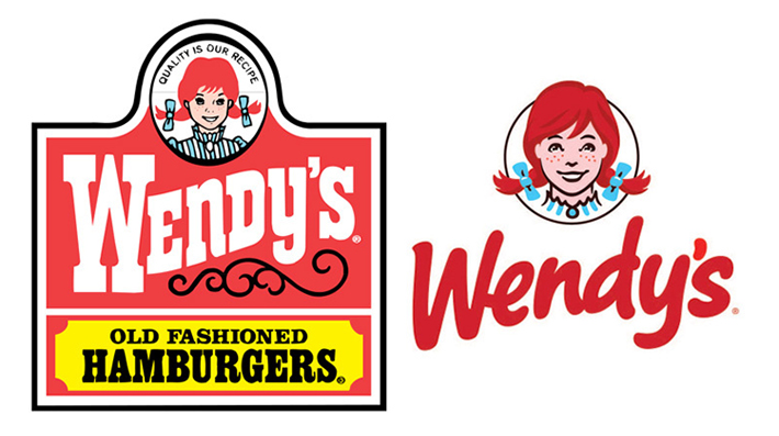
Wendy’s went from the logo that has served the company for 30 years to a more contemporary look. For the first time since 1983, the Ohio-based fast-food company unveiled this new updated logo.

The Associated Press release stated, “In a move intended to signal its ongoing transformation into a higher-end hamburger chain, instead of the boxy, old-fashioned lettering against a red-and-yellow backdrop, the pared down new look features the chain’s name in a casual red font against a clean white backdrop.”
While I understand that it needed to update its outdated image (and the new logo is definitely an upgrade), I don’t understand the “higher-end” aspect of this refresh effort. How does Wendy’s cute portrait accompanied by this typeface imply “higher-end?” Doesn’t it come across as something targeting youngsters?
I also don’t understand why the word “hamburgers” is missing. Without this key descriptor, Wendy’s could be a toy store or a clothing store just as much as it is a burger joint.
Rebranding isn’t done on a whim, nor is it simply a cosmetic facelift.
Real rebranding is highly strategic, intelligently conceived, complete, and interconnected. It answers very specific questions to guide and position a company.
It upsets me that these companies are not being better taken care of by those who promise them new brands. But it really upsets me that the leaders of these companies aren’t taking better care of their brands. They are walking into agencies without a clearly articulated vision, mission, or position, and asking for a new identity. All the agencies are left with are meaningless creative briefs to try and make a company look more cool or edgy.
The bottom line is the madness needs to stop. If it doesn’t, good companies will never become—or remain—great, and millions of dollars will continue to be wasted.


12 Replies to “The Worst “Rebrands” of 2012” .
Can’t agree more… except for Wendy’s!
Thanks Guillermo. While I love the design of the new Wendy’s logo, it’s the fact that they called this a “rebrand” aimed to make them look more high-end. There’s nothing “high-end” about this design. It’s fun and playful, not classy and formal. If they had just called it what it was—a new and fun update to its old and traditional logo, then they’d be in the clear.
Every company has it’s expertise. My company “hires out” stuff that we don’t do, and are not experts in. One of the things we hire out might be a rebranding exercise on a logo. Not being experts, how do we know if we’re getting a good or bad result in the eyes of other marketing experts?
Meaning: the common man might say “that’s a nice fresh change” where a marketing expert might say “wow – what a joke, they got hosed!”
In my experience working with other marketing companies, the “big reveal” is always a process of convincing the customer that the presented idea is grand, and how it stands to support the direction we’ve chosen. It always seems so subjective.
Granted – we’ve not done business with Urban Jungle yet – so maybe there is a quality difference that I’ve not experienced yet…
Great questions Greg! In my opinion, it doesn’t really matter what the experts think, especially if they weren’t involved in the process. All that matters is whether or not the branding/design/marketing/communications project achieved the intended results.
If the intention of redesigning your logo is simply to get your customers to say, “that’s a nice fresh change,” and this ends up being the outcome, then you have achieved your goals. It’s when the intentions/expectations and outcomes are misaligned where one might think ‘wow…they got hosed!’ I believe all of the companies I listed in this post didn’t understand the true function of branding or rebranding. If they did, they wouldn’t have communicated their efforts as “rebrands.” Instead they would have said they were simply refreshing or updating their image.
Design shouldn’t be subjective either. Design without strategy is art. And art is completely subjective. In my experience, when a solution is directed by a strategy and when the client is involved throughout the strategic process, the solution to the problem is rarely left to a “big reveal.” The answer is usually obvious and as such there’s no need to “convince the customer that the presented idea is grand.”
This is one of the best articles I’ve read! I was always sensitive about branding after taking a long term interest in design since childhood. I can relate to the section on Gap and JC Penny’s rebranding as a similar situation happened to one of the most iconic brands of our time, Neilson – a Canadian dairy company. When they were bought by Cadbury in the late 80’s, they removed the word, “Neilson” on Jersey Milk’s candy bar and replaced it with “Cadbury” and sales dropped significantly along with tweaks to Jersey Milk’s ingredients. They quickly switched back to the “Neilson” brand and the sales went back up. It’s interesting how the world works.
Thanks Besa! I’m glad you liked the article. I was still popping zits when Cadbury acquired Neilson and dropped its name from the Jersey Milk package so I’m not too familiar with the situation.
I’m surprised that the manufacturer’s name change on the label had any impact in sales at all. Neilson wasn’t the product brand and therefore it wasn’t the brand the public bought; Jersey Milk was. I suspect the change in the packaging and the ingredients, as well as the change in brand managers, staff, suppliers, vendor relationships, and advertising played a much bigger role in the situation than simply the name change on the label.
Regardless, I’m glad you pointed it out. I’m going to do some more research on this purely out of interest’s sake. It might turn out to be a great case study!
Good list. The Gap one blew my mind, and the jcp logo looks like they are trying to enter the financial market. The four squares of the Windows logo looks kind of like a window to me, with four different colored panes, so although it is weak and imitating Apple, I get it.
Thanks for the article, it was a fun read!
Great post Craig!
Posts like this are great because it reminds us that “identity” is represented by several brand touch-points, but there are also a ton of other connections that make a brand what it is.
Microsoft is really interesting to me. The transition in the logo is representative of some major moves that they’ve been making and are going to make. Different colours of “windows” means work and play – use Microsoft for all parts of life. Microsoft is still predominantly a business brand.
The windows are also a strong repeatable image of the new operating system (Windows 8), and what you see on the Surface and the Mobile version of the OS. Continuity and consistency of experience. Totally nerding out here and I’m going to stop – but I think it’s also a bold strategic move to marry Microsoft (the company) to the iconography of Windows (typically reserved image for the software). Perhaps to reinforce the issue that Microsoft is a software company first? That part I’m on the fence about. I don’t know what do you think about all that?
Hi Jason! Thanks for commenting. I get that the new logo is representative of the moves Microsoft is making. I just think its execution was complete garbage. There is nothing edgy, innovative, or inspiring about it. It’s completely void of personality.
One of the most exciting things I followed that came in the wake of this rebranding debacle was the work of a student named Andrew Kim. Kim’s re-imagining of the identity as complete and interconnected rebranding effort was nothing short of stellar.
I published a blog post on it for your reading pleasure.
I have to disagree with your comments about Microsoft. This is obviously a throwback to their main product, Windows and with the company moving forward with their (maybe misguided) strategy to have Windows 8 being the base platform for all their products (PC, Tabelt, Phones and XboxOne) it makes sense to bring them under the one brand umbrella. Also, I feel that the flat logo also harks in the concept of Windows Tiles.
I also feel that Wendy’s went in the right direction by removing Hamburger from their logo. Their product mix has grown so much in the last 5 years that it would be very limiting. This is the same train of thought that Starbucks went through when they chose to remove the word Coffee from their logo.
Interesting points David. I appreciate your input. Yes of course the design is an homage to Windows. I just think the execution was weak. As I mentioned in a response to Jason above, it could have been so much more—for example, the work done by Andrew Kim. If Microsoft came out of its rebrand with his work, I believe it would have re-established itself with a much stronger position in the customers’ collective mind.
As for Wendy’s, I agree the “Old Fashioned Hamburgers” descriptor was limiting given its evolved product mix; however, I would see this as an opportunity to help redefine the brand with a better descriptor. Instead the descriptor was dropped and now there isn’t anything to effectively communicate the brand’s position.
I also disagree in the parallel you’ve drawn to the Starbuck’s case. While Starbuck’s has removed the name and descriptor from it’s “badge” or iconic logo, every Starbuck’s location clearly displays the wordmark logo “STARBUCK’S COFFEE” on the side of the building separately. To that end, it is still communicating itself properly.
[…] Especially when compared to 2012. Still, some rebrands did manage to bonehead their way to stardom and here-within are my picks for the three worst rebrands of 2013. […]
Comments are closed.