Creativity | Urban Jungle
The Inspirational Alphabet Logo Design Series – Letter Ee Logo Designs
The fifth collection of design potpourri includes my top 10 favourite letter Ee logos. As you can see, the lowercase e is grossly underrepresented (which is too bad because it's a beautiful letter). 1. E is for Elena (concept by Elena Lazutina) 2. e (concept…
The Inspirational Alphabet Logo Design Series – Letter Dd Logo Designs
Round 4 of the Inspirational Alphabet Logo Design Series comprises my top 10 favourite letter Dd logos. Just like the letter Bb, it was tough finding good lowercase d's. I know they're hiding out there somewhere though. 1. D's Nuts (concept by Ron Lewis) 2.…
The Inspirational Alphabet Logo Design Series – Letter Cc Logo Designs
The third instalment in the Inspirational Alphabet Logo Design Series comprises my top 10 favourite letter Cc logo designs. In my experience the letter C is one of the more challenging characters in the alphabet to create interest in. My respect goes out to all…
The Inspirational Alphabet Logo Design Series – Letter Bb Logo Designs
The second collection in the 26 part, art for art's sake series is of some of my favourite letter Bb logo designs. When it comes to the letter B, there are so many amazing designs and it was hard to narrow it down to just…
The Inspirational Alphabet Logo Design Series – Letter Aa Logo Designs
A quick peruse of Urban Jungle's website and you quickly discover that whenever we're examining logos we're usually discussing the strategies around them. This is not one of those times. The Inspirational Alphabet Logo Design Series is an homage to the letters of the English…
The Microsoft Rebrand. What Could Have Been.
One of the most exciting things I’ve followed in the wake of Microsoft's rebranding debacle is the work of a student named Andrew Kim. Kim's re-imagining of the identity as a complete and interconnected rebranding effort is stellar. In fact, it was so well-received by…
The Importance of Brand Colours
Colour. It's arguably the most important component of a strong and easy to recognize brand identity. Without colour, brands wouldn't exist in our minds quite the same way. What if we were to change the colours of a few of the world's most recognized brands?…
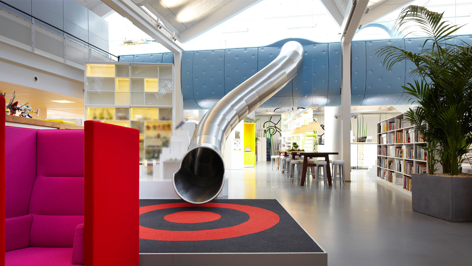
Reinforcing Brand Through Interior Design
Retail brands like Apple get it. Hospitality brands like Hudsons Canadian Taphouse get it. Arts and culture-focused brands like the AGA get it. But interior design is an often overlooked aspect of reinforcing brand in both the corporate and professional environments. This company clearly doesn't…
Design Inspiration can Come from Anywhere
As designers, it’s easy to look at a singular item (be it a logo, a business card, a brochure, etc.) and think to ourselves, ‘I like this, I don’t like that’… but pulling together a cohesive brand identity, and incorporating the look, the energy, the…
It’s Smarter to Travel in Groups
It's not too often I comment positively on advertising, but every once and a while a rare treat arrives in my inbox that's too good not to share. Today is one of those days, and this is one of those treats. The following is a…
- 1
- 2


