Art | Urban Jungle
The Best Rebrands of 2013
2013 proved itself to be a strong year for rebranding. Especially in Australia and Canada. That's not to say there weren't any duds. Earlier this month I examined the three worst rebrands of 2013. Today I’m switching gears and focusing on the best. While it's…
Design Inspiration can Come from Anywhere
As designers, it’s easy to look at a singular item (be it a logo, a business card, a brochure, etc.) and think to ourselves, ‘I like this, I don’t like that’… but pulling together a cohesive brand identity, and incorporating the look, the energy, the…
A New Twist on Animals in Advertising
Are you as sick of seeing animals in ad campaigns as I am? Usually their presence in ads is completely irrelevant to the product or service they are selling, and generally they're used as a ploy to distract you from how bad the product or…
CDN Designers Help Set Stage for Olympic Games…Literally (Part 3)
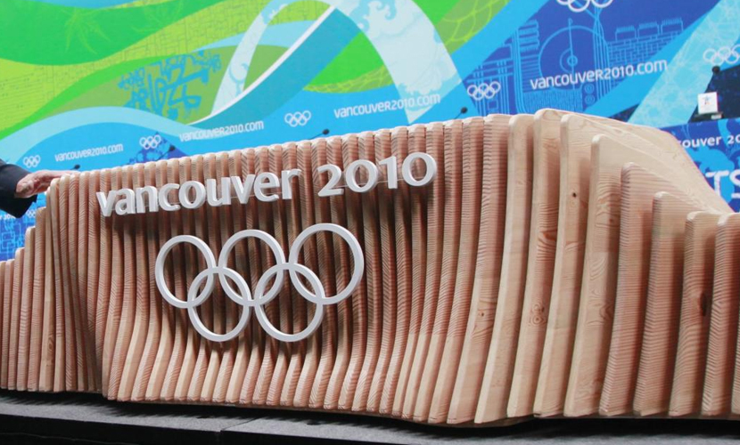
Olympic Podium & Medal Tray Design: To design an Olympic podium is to develop a platform from which a spirit can soar. Any Olympian graced with the opportunity to stand on the top of one will undoubtedly concur. Trust me. I watched it, night after…
CDN Designers Help Set Stage for Olympic Games…Literally (Part 2)
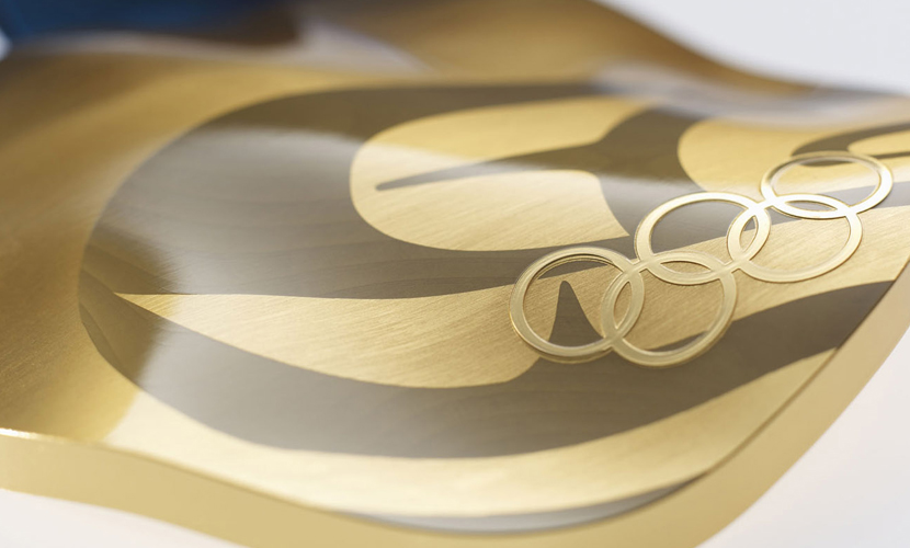
Olympic Medal Designs: Developed as a smaller piece built from a larger image, representing the value of interaction with community and importance on individuality, the medal design for the Vancouver 2010 Olympics has definitely set a precedence; or raised the bar if you will for…
CDN Designers Help Set Stage for Olympic Games…Literally (Part 1)
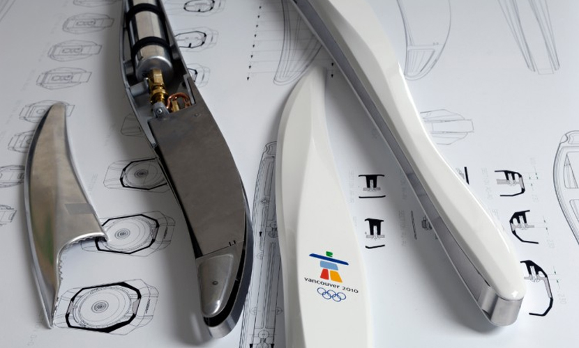
Moving past the stunning visuals and artistic presentations Canadians have already proven to showcase for the 2010 Olympic and Paralympic games one cannot help to be taken aback with the detail of the other pieces of design Olympians, their families and spectators will interact while…
Illustrations Say 1000 Words
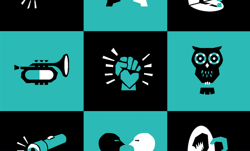
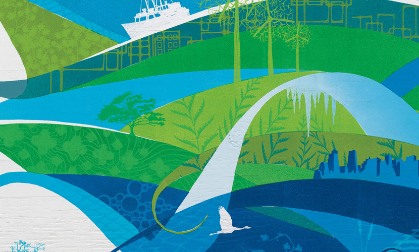
Stylized Graphics Set Tone (& Texture) for 2010 Games Upon first glance I immediately thought “there is something different about the way Vancouver is presenting their Olympics”; it wasn’t until my second that I realized what it truly was. Vancouver 2010 was completely photography free.…


