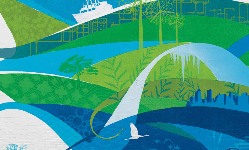
Stylized Graphics Set Tone (& Texture) for 2010 Games
Upon first glance I immediately thought “there is something different about the way Vancouver is presenting their Olympics”; it wasn’t until my second that I realized what it truly was. Vancouver 2010 was completely photography free. Free from the concern about rights usage and proper resolution. Free from formatting issues and Photoshop hours. And free from the limiting factors of depicting specific style, positioning, age, race as well as gender. Below are the ways they gained from their new found freedom as well as the journey through creative process that lead their team to this conclusion.
Multiple Elements Allow for Multiple Uses
These subtle yet impactful designs base their look on energy and movement however, an emphasis on form and flux can quickly become overpowering if not developed carefully. To do so successfully it is imperative that a foundational formula be built. Consistently inconsistent use of swoops and swirls piled with textures in hues of blue and green create the basis of this framework. Because of the organic, and almost random, nature of the layered background textures it allows for quick and easy application to all designed pieces. Here are is a listing of the variety of ways they I have seen them applied:
- Banners flanking presentation stages and along fences
- Bus Passes
- Commemorative programs
- Detail on volunteer uniforms
- Website banners: Vancouver2010
- Bookmarks
- Flags


-
The Message
It is easy to convey a single emotion with a single image but to convey multiple emotions repeatedly in multiple images involves true mastery of the art of design. These illustrations for me do just that. In fact the depiction of each of the athletes constantly convey a strong feeling of perseverance, focus and drive regardless of the sport. Added to that are the elements of nature that speak to what Canada, physically, really is. The environment is woven into these icons through their developed colour pallet and natural references whether it be dragonfly wings on a float plane or the presence of stylized clouds subtly placed onto the background. Overall, I feel that through these designs we as Canadians are better able to tell the story of what makes us who we are.
How They Got There
Hours of brainstorming and inspiration collecting was the platform in which Vancouver 2010’s Creative team used as their jumping point. Check out the video outlining their process.


