2013 proved itself to be a strong year for rebranding. Especially in Australia and Canada.
That’s not to say there weren’t any duds. Earlier this month I examined the three worst rebrands of 2013. Today I’m switching gears and focusing on the best.
While it’s impossible to know the depth of the underlying brand strategies; from the results these organizations achieved, each has clearly put strategy before creative.
From redefining their visions and market positions, to reshaping their audiences’ beliefs and perceptions, going through the complete rebranding methodology delivered first-class executions, and ultimately brands of more substance.
Here are my picks for the three best rebrands of 2013:
3. QUAGOMA:
The Queensland Art Gallery (QAG) was the original arts institution in Brisbane, Australia dating back to 1895.
In 2006, the Government of Queensland created the Gallery of Modern Art (GOMA)—the second gallery within the Queensland Cultural Centre. While QAG was known for its preservation of Indigenous Australian art and its innovative museum-based learning programs for children, GOMA had quickly become the largest gallery of modern and contemporary art in the entire Australian continent.

The success of GOMA led to the perception that there was a split and that one dominated the other. To make matters worse, the two buildings were situated only 200 meters apart. As parent, the Queensland Cultural Centre leadership team stepped in and devised a strategy to unite its two kids under a single brand, which reflected everyone’s achievements.
QAG and GOMA fuse to become QAGOMA.
“We embraced the unique situation of having two galleries work hand in hand to offer richer, complementary experiences,” stated Chris Saines, QAGOMA Director. “We created two subtly different personalities, and together, they play out across both galleries. Like siblings, sometimes they agree, sometimes they disagree. And sometimes they complete each other’s sentences. Together, they tell two sides of the same story.”
The solution is brilliant. Rather than allowing the infighting continue to divide both staff and visitors, this strategy creates a more well-rounded experience and aligns its audiences. Unified and stronger, QAGOMA can now focus its efforts on building a strong, established international brand positioned alongside MoMA and the Guggenheim Museum.
View this short video on QAGOMA’s brand development.
2. Royal Roads University:
Canada’s post-secondary marketplace is highly competitive. Bricks and mortar institutions still reign supreme, but the popularity of online schools is steadily increasing.
Royal Roads University in Victoria, British Columbia offers a unique blend of both models. Unfortunately it was ineffective in differentiating itself. Tired, stodgy, and dated, the university’s image was at a competitive disadvantage in attempting to attract the younger demographic
With low awareness and a lack of understanding of its program delivery options, Royal Roads needed to re-establish itself as a credible, prestigious and progressive university.
After workshopping the brand and engaging its stakeholders in the strategic process, the brand architecture was created for Royal Roads’ academic, corporate and partner entities. A new brand identity was created for Royal Roads as well, including the development of a new logo, tagline, and key messaging.
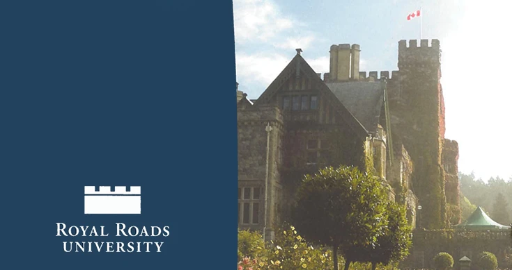
Its logo pays tribute to the iconic Hatley Castle (aka Xavier Institute for Higher Learning), while connecting the university to the digital future through its incorporation of a pixelated pattern. This creative strategy grounds the university in its rich heritage, while leveraging its online course delivery model. It blends the old with the new, the onsite with the online, and celebrates both Royal Roads’ ‘clicks and mortar’ offerings.
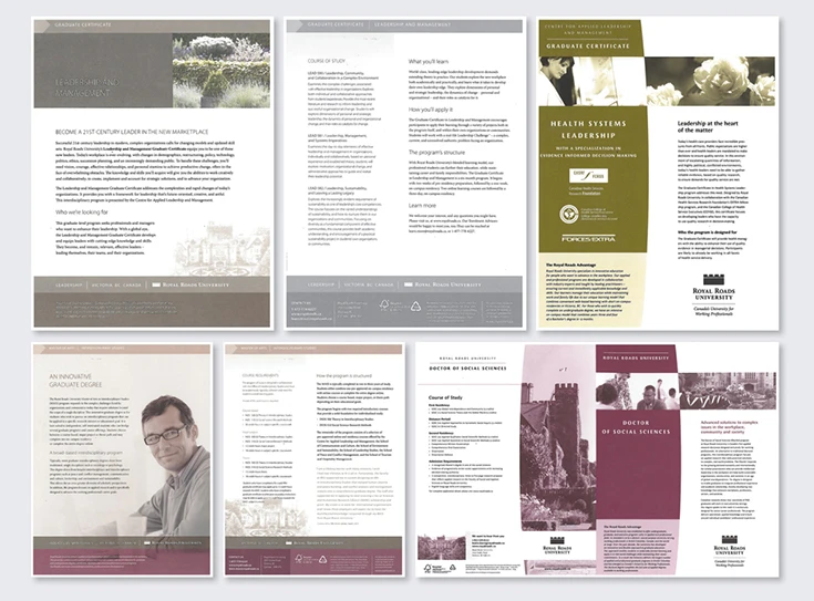
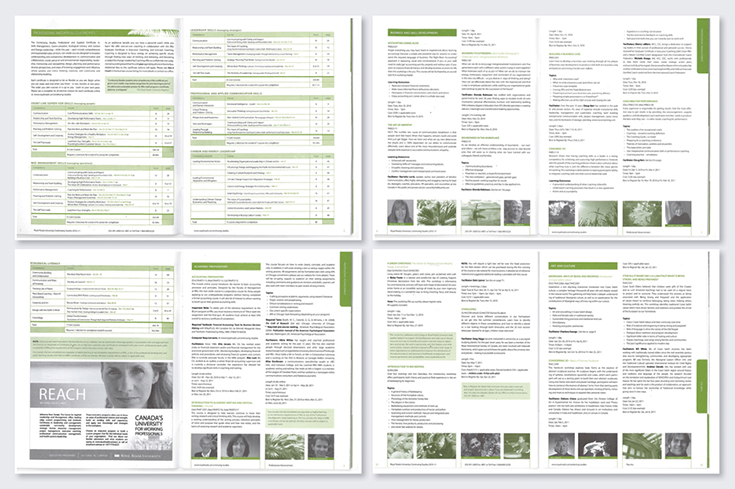
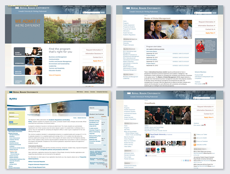
A number of visual components were also updated during the activation ranging from its signage and marketing collateral, to its website and advertising campaigns.
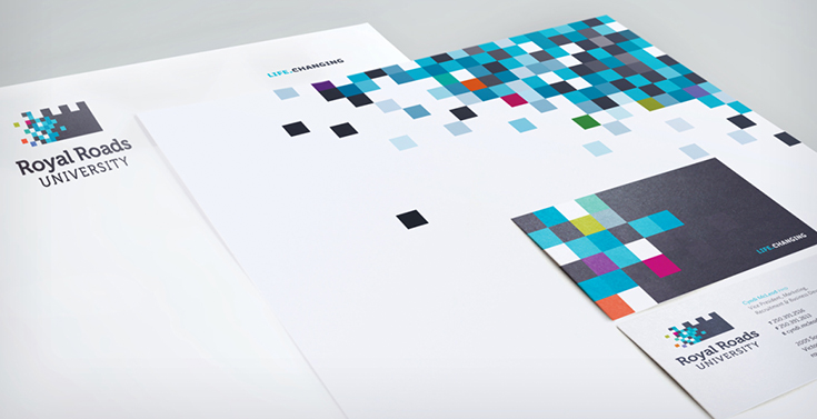
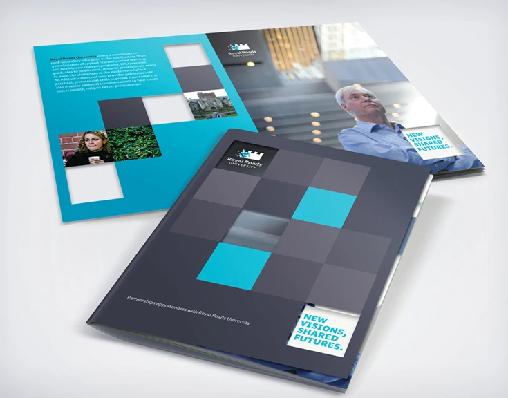
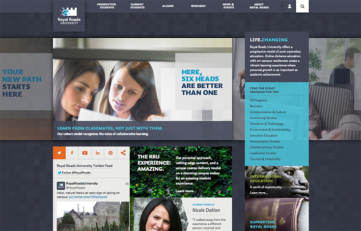
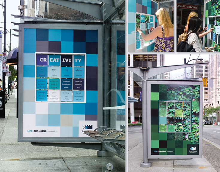
While enrolment statistics are not yet available, the activation of the updated and repositioned brand resulted in a 250% increase in website visits versus the same period last year. Reports also suggest the University’s various stakeholders are now aligned and everyone is working towards a common vision with new energy and passion.
1. Alzheimers Australia:
My top pick for best rebrand of 2013 is Alzheimer’s Australia.
As Australia’s third biggest killer, Alzheimer’s disease is projected to kill more Australians by 2030 than cancer, and there is no cure.
Sitting at the lowly 112th position for total donations and funding received, the Australian government didn’t recognize Alzheimer’s as a chronic disease. In order to stand a chance of gaining extra funding, Alzheimer’s Australia needed to be a top 10 charity.

Stigmatized, underfunded, and ignored, Interbrand Australia was given the challenge to “put a bloody great big bomb under the problem, and turn the unspoken into the unforgettable.”
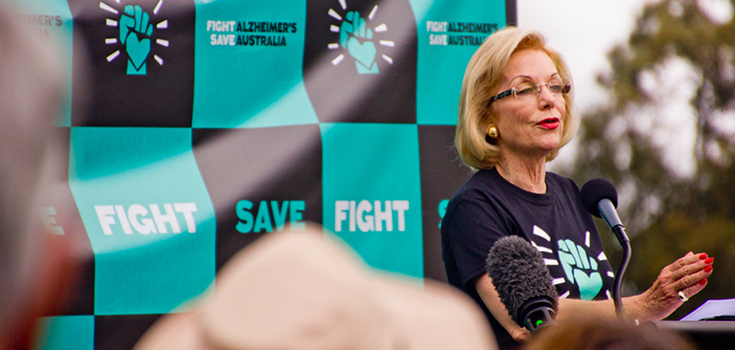
With that in mind, a highly effective but heartfelt strategy was devised to paint Alzheimer’s disease as villain, and Australia as hero by embedding a “fighting spirit” at the brand’s core to galvanize Australians around the cause.
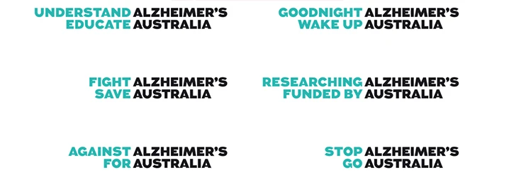
Alzheimer’s Australia created a flexible messaging system to communicate the organization’s name, highlight the problem, and feature a strong call-to-action. It’s versatility speaks to sufferers, care givers, the public, and government.
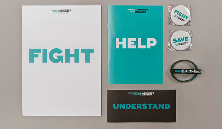
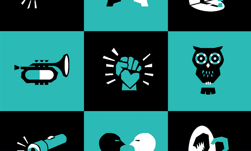
In addition to it’s strong messaging, Alzheimer’s Australia designed an edgy and beautiful design system which includes an iconic logo, contemporary colour palette, and quirky illustrations.
![]()
View this short video on the brand activation.
Alzheimer’s Australia has my nod for best rebrand of 2013 not for its brilliant messaging, pretty logo, $700,000 in free media generated, or its 150,000 iPhone app downloads. But rather for the results it achieved. Pure and simple.
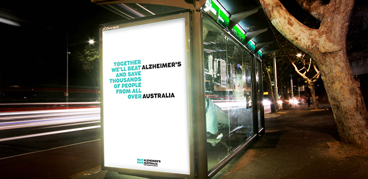
This rebranding effort went well beyond clever tactics and creating buzz. It educated the public and government by turning understanding into action. It transformed a passive, disjointed organization into a proactive unified front. It generated $300M in additional funding and received substantial funding from pharmaceutical giants Pfizer and BUPA. Most importantly, it prompted the Australian government to change its policy, making Alzheimer’s disease a national health priority.
What do you think?
Did I get it right? Or was there another rebranding effort in 2013 that stood out among the rest? Feel free to send me your insights and opinions.
Content references and image sources: http://www.rebrand.com/




2 Replies to “The Best Rebrands of 2013” .
Great choices Craig. Very inspiring!
Thanks Leslie. I’m happy to hear you found these inspiring. I did too. These organizations and their respective agencies nailed it.
Comments are closed.