Since Marissa Mayer took the helm as CEO last year, search engine challenger brand, Yahoo kept itself pretty busy with acquiring Tumblr, overhauling Flickr, redesigning its email service, and fine-tuning its fantasy sports offering.
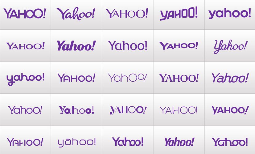
After a year of progress, Yahoo announced in early August its plans to unveil a new logo. Not one logo, but 30 logos over the course of 30 consecutive days. On the 31st day it would choose the winning design to move forward with.
Here’s a teaser video advertising the campaign.
And this is the end result.
That’s Yahoo’s take on releasing its new logo in a “cool” and “edgy” way.
For the 11% cottonheaded minority who actually still use Yahoo for search, I’m sure these last 30 days were quite confusing.
For the remaining 89%, it was business as usual. Most of us probably didn’t even take notice.
I for one, am with the cottonheads. I’m confused.
This logo refreshing campaign raises a lot more questions than it answers.
How does the winning logo facilitate Yahoo’s goals of battling for second spot against Bing?
How does the winning logo communicate the “new experience” more than the other 29 logos? Without context and a narrative it’s completely subjective. A poll of 30 people would likely result in 30 different answers as to which is their favourite.
How can unveiling a bunch of half-baked logos be a good idea? They completely dilute the end result as “rebranding” is presented merely as a font change. It validates there was lack of any brand strategy and that this was a pure fluff marketing play to generate some nice press for a month.
Is the new design modern enough to communicate Yahoo’s innovation? Is the departure radical enough to change perceptions of the brand?
Kathy Savitt, Yahoo’s Chief Marketing Officer says the new logo is “a modern redesign that’s more reflective of our reimagined design and new experiences. We wanted a logo that stayed true to our roots (whimsical, purple, with an exclamation point) yet embraced the evolution of our products.”
I’m not convinced, but only time will tell. What say you?


One Reply to “Dejahoo. Yahoo Unveils New Logo.” .
[…] of unveiling one logo as most brands would, Yahoo thought it would be hip and edgy to unveil 30 logos over the course of 30 consecutive days. On the 31st day it would choose the winning design to move forward […]
Comments are closed.