Last week I discussed what were in my opinion the five worst rebrands of 2012. The major theme running through these fragmented, incomplete messes was the fact that they were not rebrands, rather incoherent logo redesigns called “rebrands.”
This week I’m looking at the three best rebrands of 2012.
Leaders in their respective industries, each company appears to have prioritized strategy by going through the complete rebranding exercise—including redefining their market position to guide their customers’ beliefs, and executing a complete and interconnected brand strategy.
Winner: Cheer – Stay Colourful
Cheer Laundry Detergent has been a leading North American detergent brand since it launched 60 years ago. Well-established as a brand made for coloured clothes, its relevance in the marketplace had faded in recent years.
The Old:

After analyzing its category, Cheer discovered that none of its competitors were speaking to Gen-Y, an untapped market doing laundry for themselves and their families for the first time.
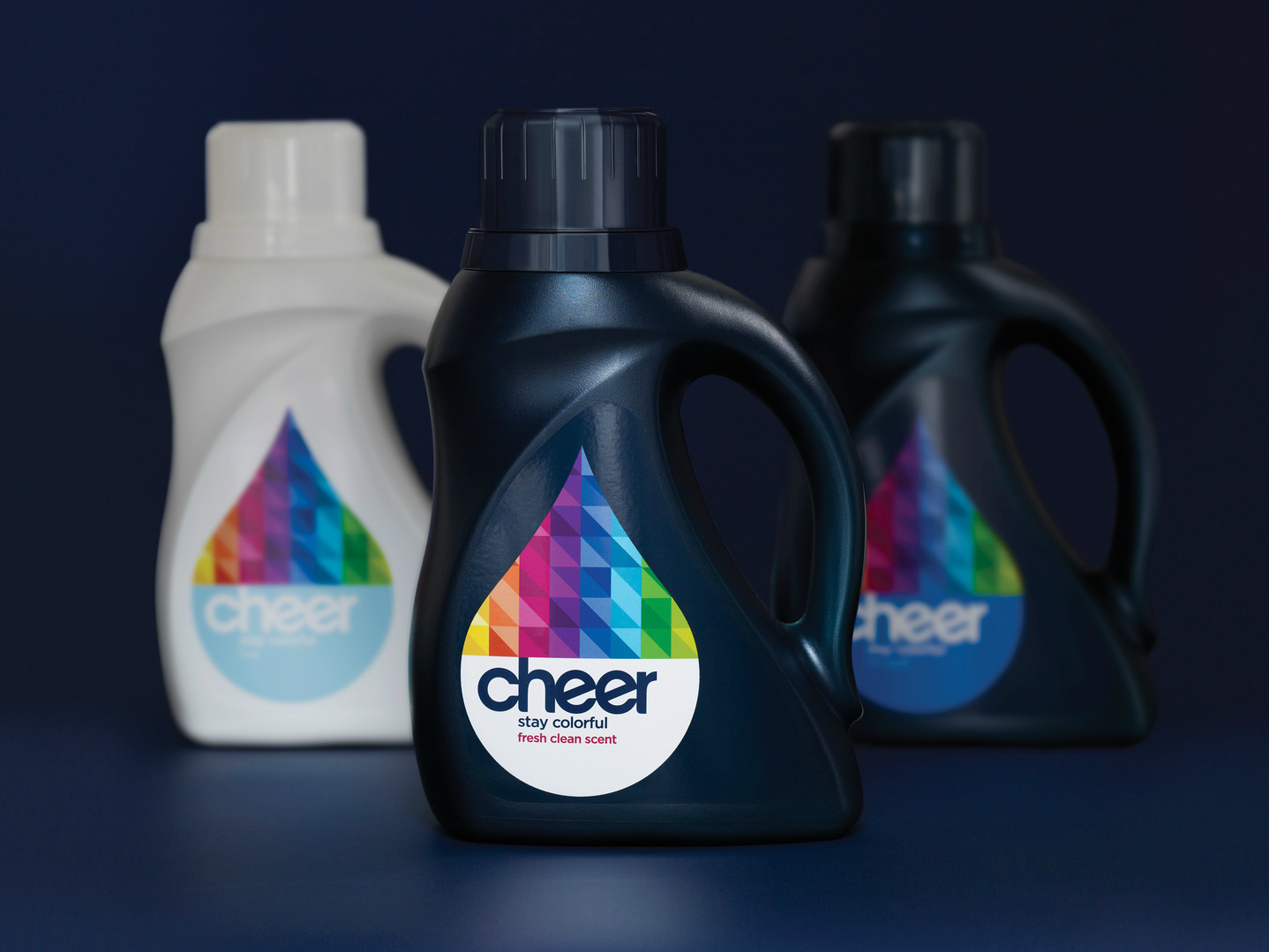
Looking forward, Cheer dove head-first into the Millennials’ world, which led it to completely redefine its position. Cheer = Colour. No longer is Cheer average and expected. Now, Cheer is alive, vibrant, expressive, and digitized. Cheer now exists as a living, breathing entity with a kinetic design system that connects with young adults in surprising and unexpected ways.
The New:
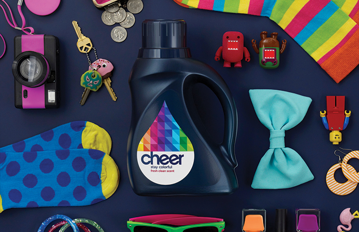
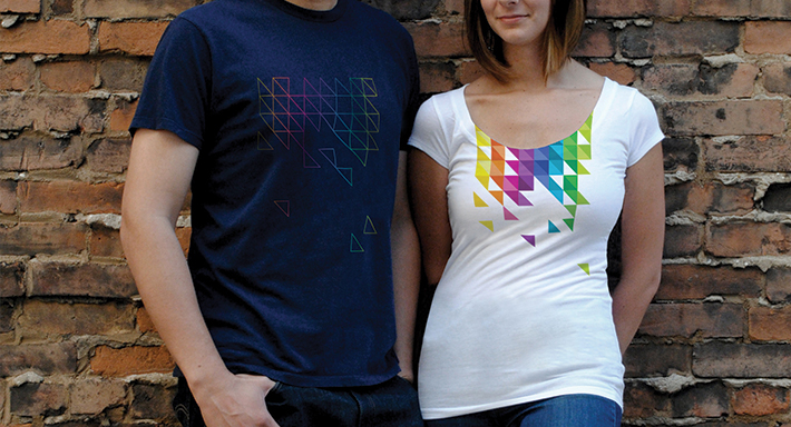
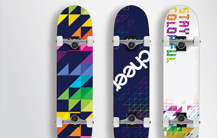
This system manifests itself through an updated identity, changing patterns, and an arresting midnight blue package that practically jumps off shelf. The brand that IS colour, now is able to make a meaningful connection with the right consumer—the colourful Millennial.

Runner Up: Avignonesi – Genuineness
Avignonesi is a well-known wine brand from the Montepulciano estate in Tuscany, Italy. Their Vin Santo is one of the most famous wines in Italy. Despite its popularity, the vineyard was beginning to look tired and dated, and it wasn’t well positioned in the marketplace. It was a vineyard, much like other vineyards.
The Old:
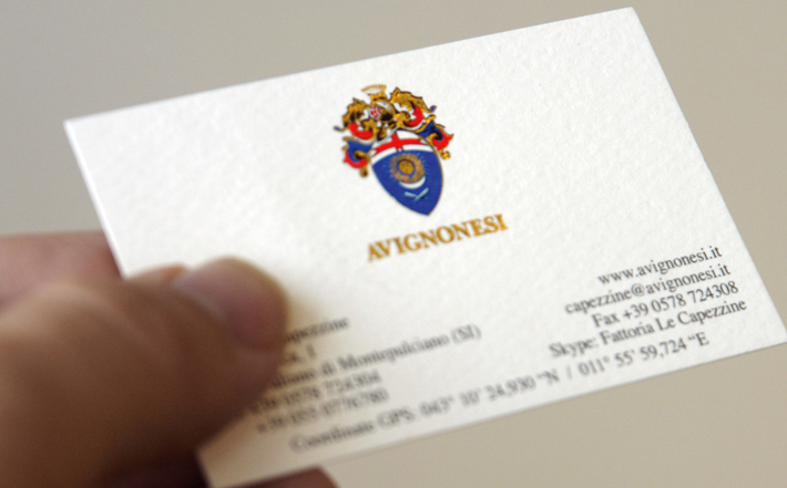
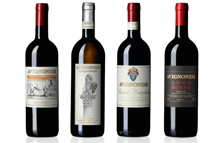
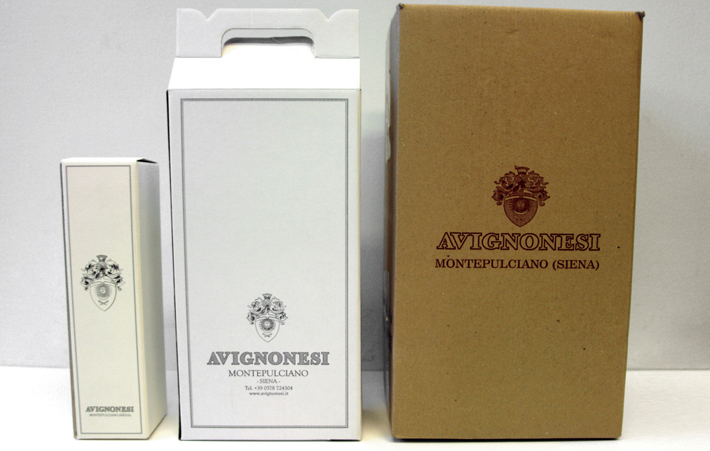
After Belgian businesswoman Virginie Saverys purchased the estate, she completely reorganized and rethought Avignonesi, turning it into a biodynamics-driven vineyard, which significantly raised the quality of all the wines. She wanted her ideas on reading and respecting the “genuineness” of the Montepulciano territory of Italy to shine through in all Avignonesi communications.
After its repositioning, Avignonesi determined “genuineness” guided by its “honesty and respect for the land” would be the central idea through all its communications. Underlining the concept is that Avignonesi is a wine that will give great rewards to those who are willing to invest themselves (producers as well as wine lovers).
The New:
After updating its identity, the concepts were translated into a brand book as well as a range of communication materials including new stationery, wine labels, packaging, barrel identification, website, mobile devices, to name a few.
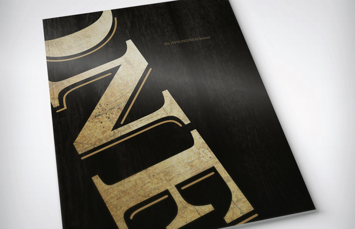
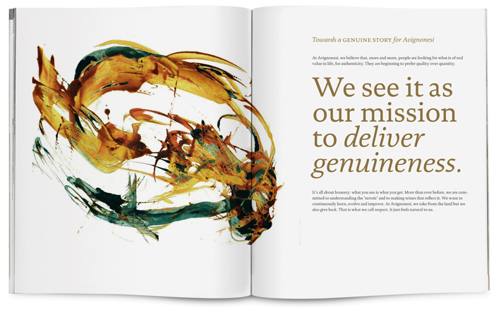
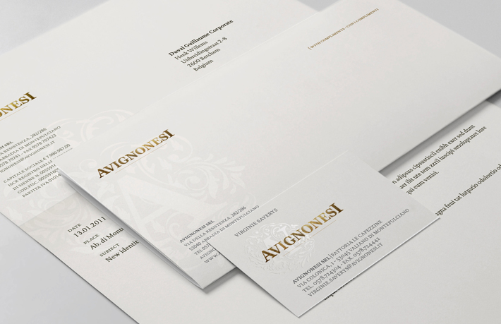
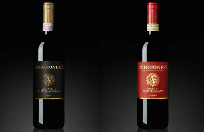
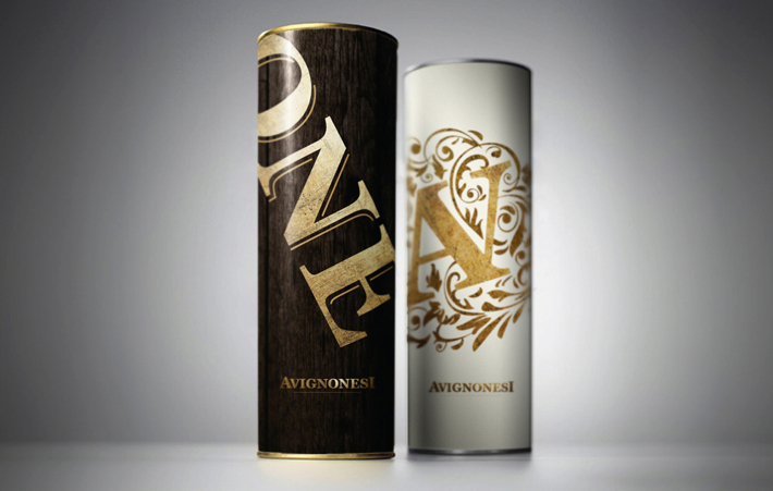
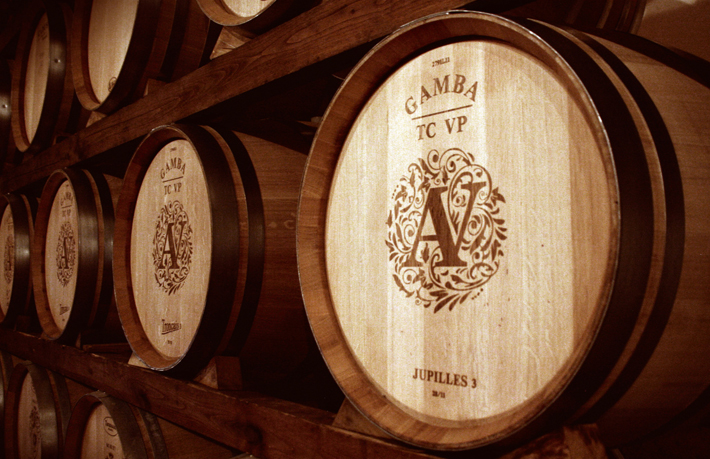
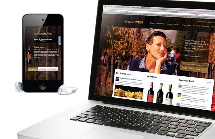
The new wines in their totally revised packaging were very well-received by wholesalers, selling out quickly. The brand story—with its focus on respect for the land—is clearly understood and appreciated by wine lovers worldwide.
Second Runner Up: Cisco – The Human Network
Cisco Systems takes third place mainly for the sheer magnitude and scope of its rebranding challenge. Another reason it made my top three was because it didn’t simply change its logo and call it a rebrand like Arby’s or Microsoft did. In fact, it never changed its logo at all.
Founded in 1984, Cisco has grown to become the world’s leading provider of networking technology selling everything from hardware to software, and servicing businesses of all sizes, including governments, service providers, and consumers.
The Old:
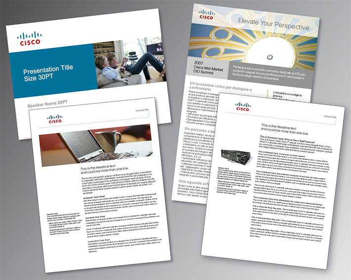
With competition rapidly increasing in its category, Cisco needed to redefine itself and present a differentiated and unified brand experience.
After an extensive brand audit, Cisco distilled its mission, “to change the way we work, live, play, and learn.” The redefined mission, was then strengthened by its core positioning concept referred to as, the ‘Human Network.’ The new concept incorporates its tech services, differentiates it from the other ‘robotic networks,’ reflects its culture of innovation, inspiration and thought leadership, and provides the company with a much more flexible and approachable platform to build from.
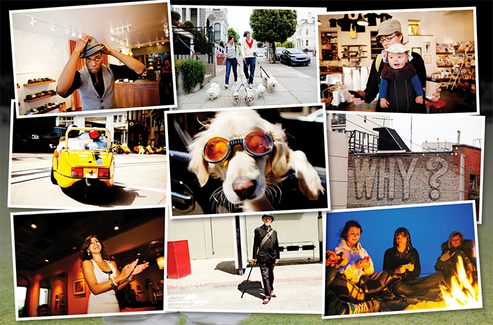
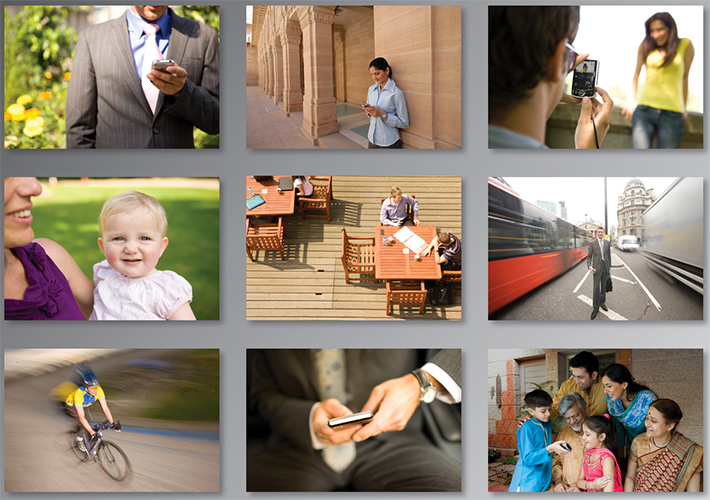
Moving into the brand experience, the company’s new design system accommodated a broad and diverse spectrum of bright colours and authentic imagery across all customer “touch points.” While the end result from the creative perspective isn’t the most ultra-inspiring, from a strategic perspective Cisco now has a guideline of brand assets that allow for maximum creativity of every marketing communications and product design effort so it can stand out and fit in simultaneously.
The New:
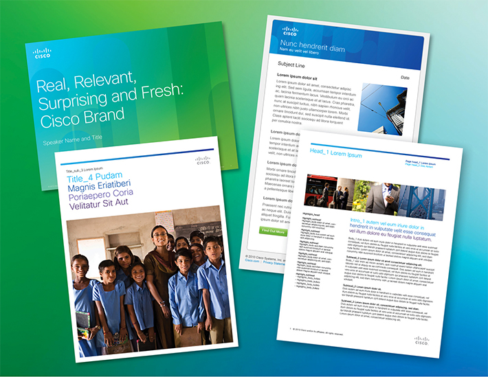
The rebrand influenced the re-architecting of its corporate website, social media practices, design of the employee workplace, and ad campaigns.
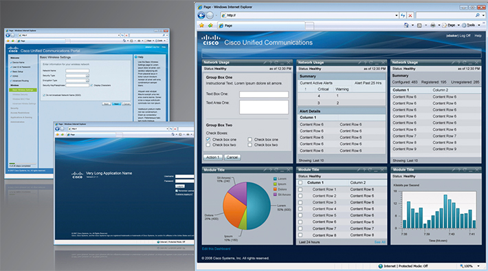
Brand standards were also adopted by its user experience teams in the development of its hardware and software products. The image below demonstrates a much more colourful and inviting user experience.

Cisco has raised its consciousness of brand alignment and the power of delivering business value in the customer experience. And for that, you get my slow clap Cisco. Congratulations on an extremely difficult job done well.
What do you think?
Did I get it right? Or was there another rebranding effort in 2012 that stood out among the rest?
Feel free to send me your insights and opinions.
Content and image sources: http://www.rebrand.com/, http://www.brandingmagazine.com/


4 Replies to “The Best Rebrands of 2012” .
Can’t agree more…except you should include Arby’s! Nah, just kidding!
Thanks Guillermo!
Another amazing post Craig. I love what Cheer did! It makes me want to buy Cheer just looking at it, even when I’ve been partial to Tide because it was the brand my mother always bought. Can’t wait until Jan!
Thanks Bruno. We’ve always been “Tide-ies” too. My wife made the change a couple months ago without even realizing it. Oh the subconscious power of brand. That’s the stuff that excites me. I can’t wait to start working on your brand in January too. It’s going to be an insightful and thrilling experience for you.
Comments are closed.