One of the things about design that is sometimes misunderstood is that it’s more than putting a pretty cover on something. There is a great deal of thought and planning that goes into every project. Whether it’s a postcard design or branding for a multinational company, there is hours (sometimes days…sometimes MONTHS!) of research that happens before the completed design is presented. Things like “Who is the audience?” and “What are we trying to convey” must be considered if it’s to be successful. It’s always great to see behind the scenes of a project and get a feel for the creative team’s thought process.

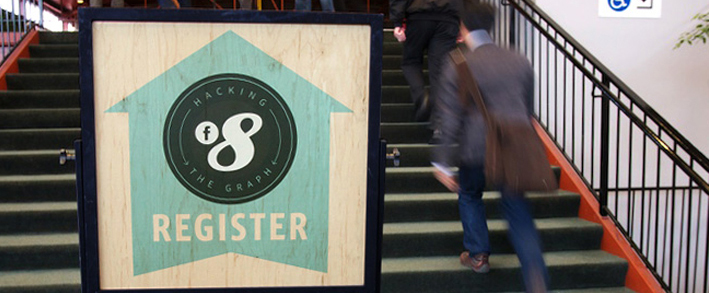
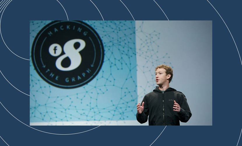
Design For Fun (The portfolio site of the amazing Bernard Barry) recently put up a great case study on the work that went into creating the design tools for f8, Facebook’s semi annual Developer Conference. The study covers everything from logo design to signage to conference attendee experience. No rock was left unturned on this project!
This is the kind of stuff that elevates design beyond being simply pretty images. It’s informative, thoughtful and communicates confidence and competence. Take a few minutes to read through the study, it’s incredibly interesting and awe inspiring to see a project go above and beyond simple design.


Personally I’m smitten with the printed glass tables, especially the one by Frank Chimero…a bit of a design hero of mine!


One Reply to “Facebook F8 Conference Design” .
Pretty tight Andrew! Thanks for finding this nugget of beauty. Maybe we’ll plan a field trip for f9!
Comments are closed.