

Services Provided: Brand Strategy, Brand Identity, Key Messaging, Brochure, Storefront Livery
A Successful Start
After Courtney Clark and Katherine Ross bought Sin 7 Salon from the previous owners in 2010, they were greeted with growth at their two locations in Whiterock, BC. Injecting an established salon with new life and energy, enabled the women to position the salon for year-over-year growth.
While the business was in good standing, they weren’t satisfied with its visual aesthetic and felt it wasn’t a true reflection of the new vision they had for it. They had a passion for hair, could creatively meet their customers’ wishes, and had a highly trained staff that made their visitors feel comfortable.
What they didn’t have was a unique brand.
Making a Name in a Competitive Market
The market for hair stylists is competitive and it can be hard to make a name for yourself based simply on your skill. So Sin 7 Salon wanted to make a splash.
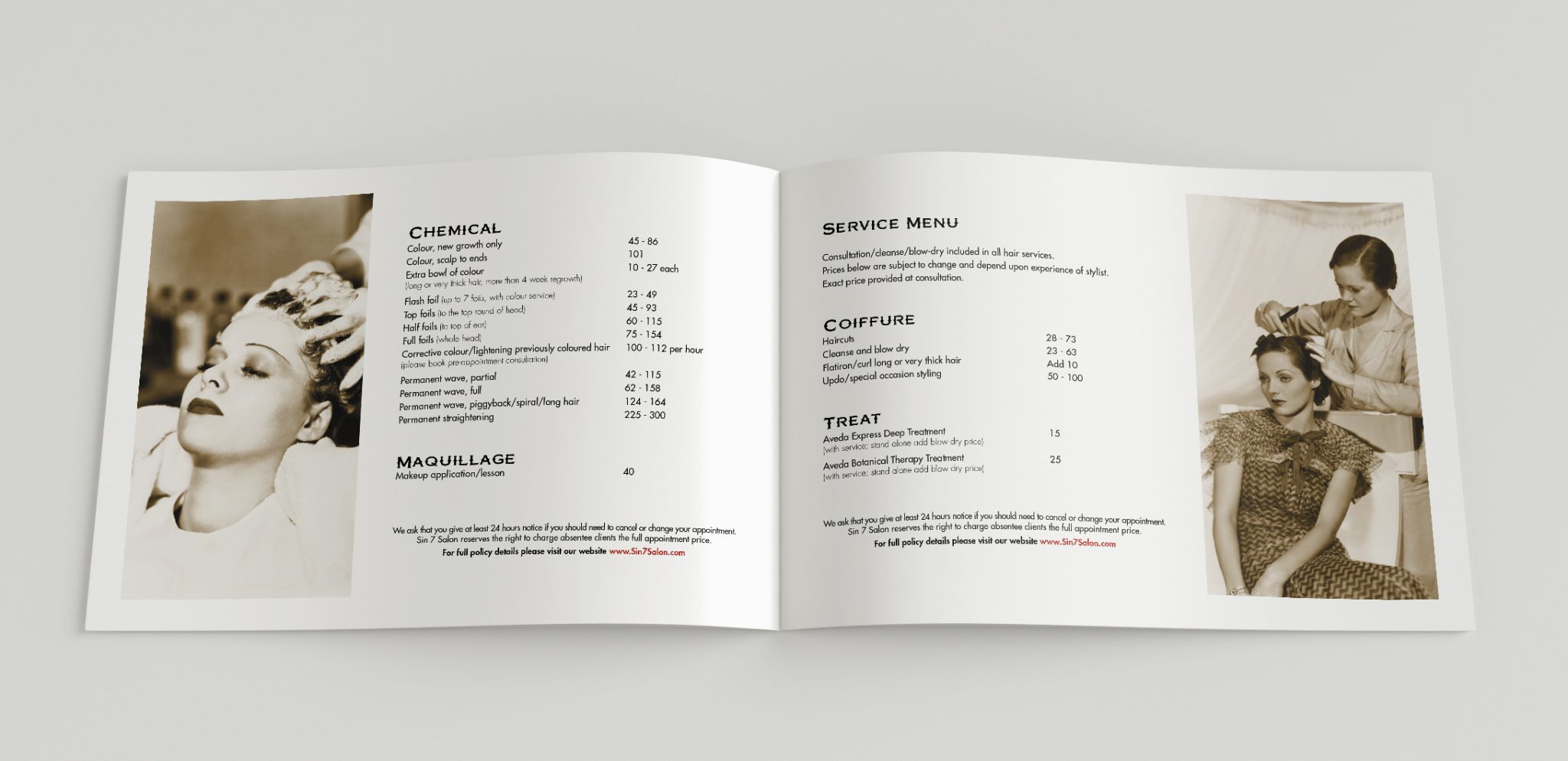
They developed ideas of using art deco and gothic styles but didn’t know how to fit them together into a cohesive visual identity. They needed logos, brochure designs, storefront livery, and designs that aligned with their personalities and interior decor. Not only that, but they wanted to have the perfect balance between vintage elegance and modern trends
So they came to Urban Jungle.
An Innovative Process
Starting with a series of discovery meetings, we established a solid foundation of ideas about what the owners wanted to do with their brand and marketing materials. From there we carefully conducted an innovative process of market research and use our knowledge of design elements to craft the perfect brand identity.
After careful research, we discovered their competitors mainly used similar floral styles, grey and blue colour schemes, and cursive motifs in their logos and designs. While it may have been working for their competition, we knew we had to do something different to establish Sin7 as a unique brand that grabbed the attention of their target audience.
Furthermore, we needed to ensure harmony among all materials, logos, colours, and fonts. Something that not only established brand unity in-line with Sin 7 personality and vision, but also engaged their target prospects, and invited curiosity and intrigue.
We needed to develop a cohesive brand.
From No Identity to a Recognizable Brand
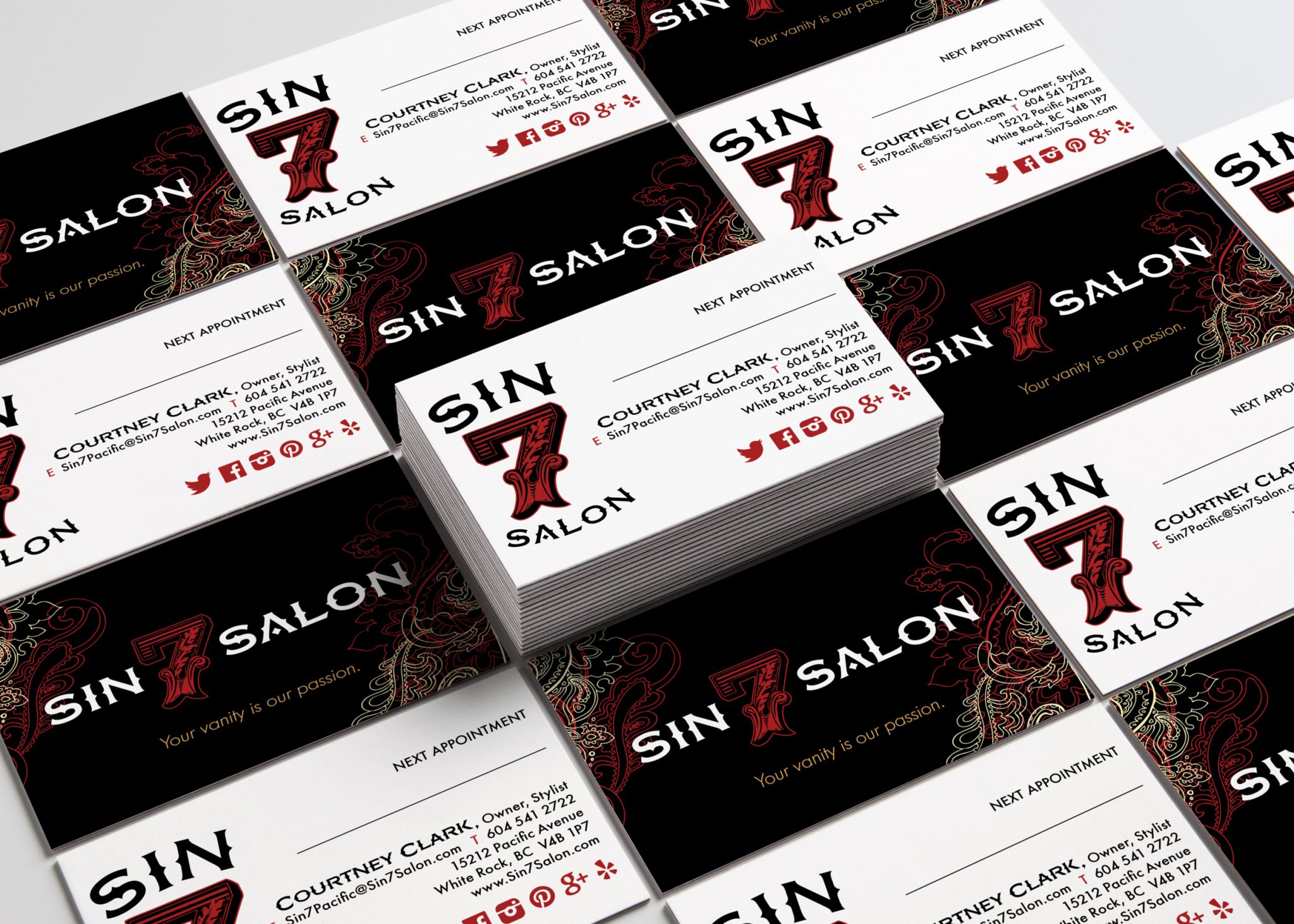
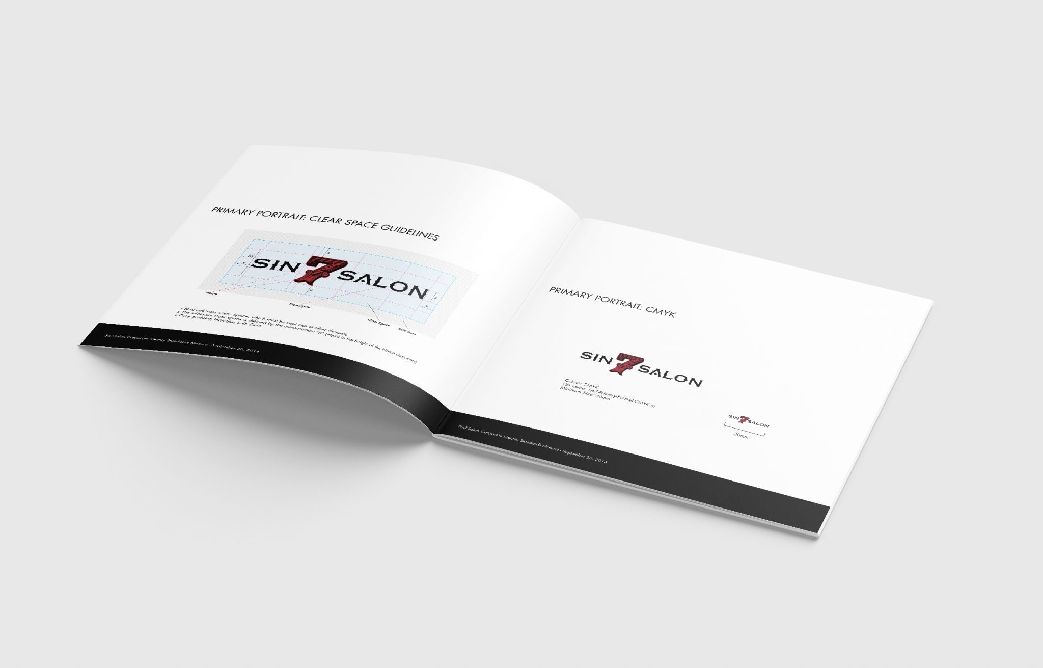
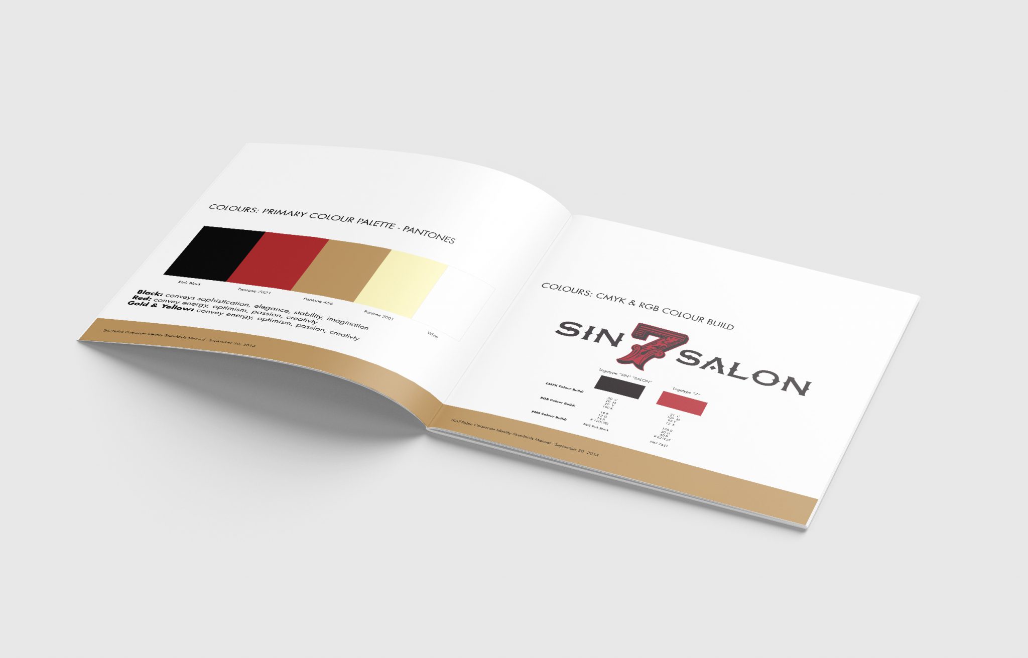
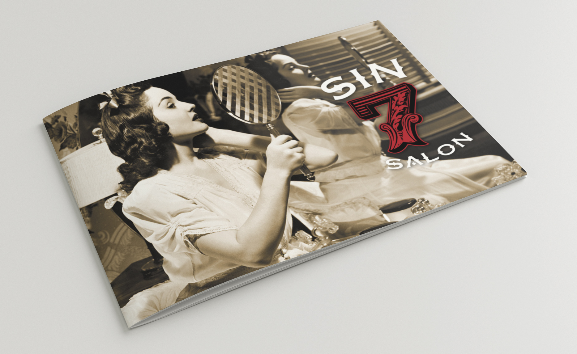
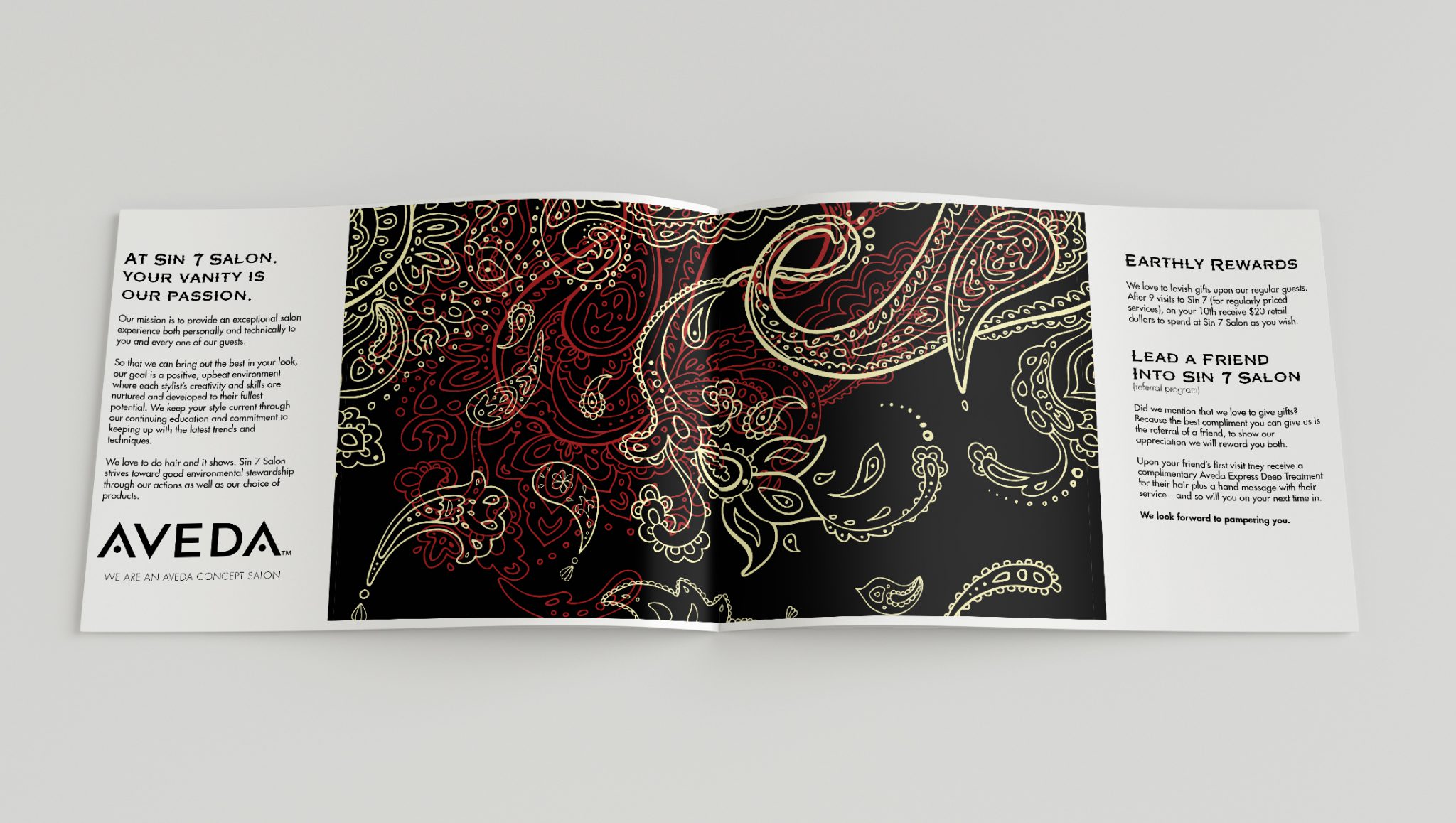
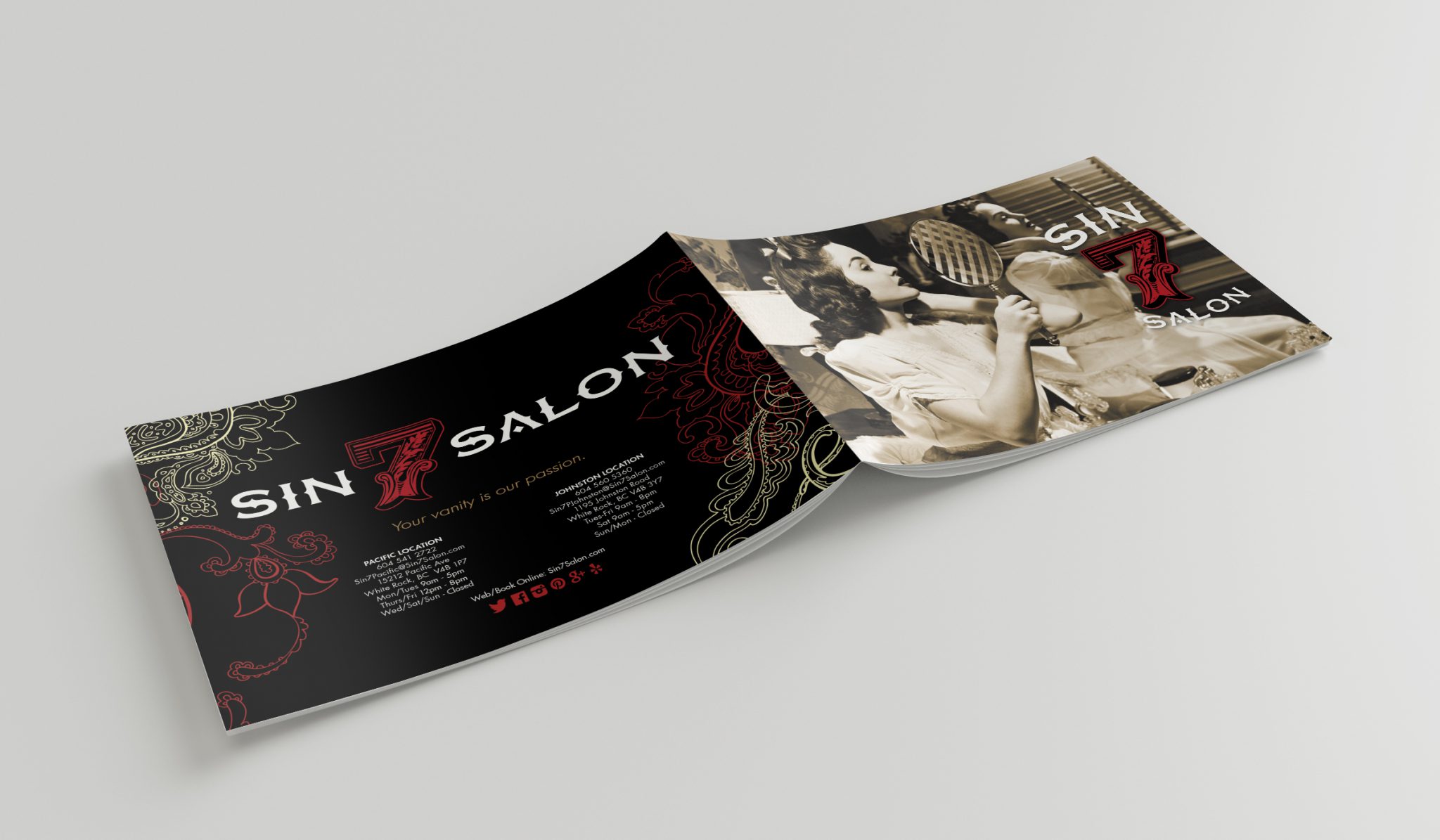
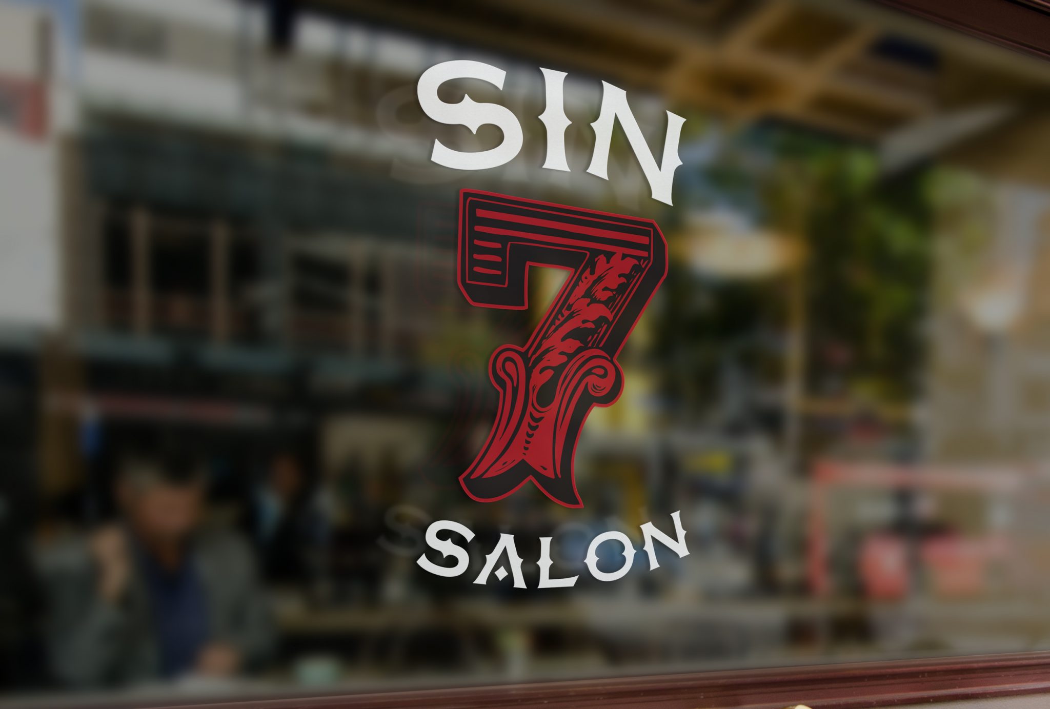
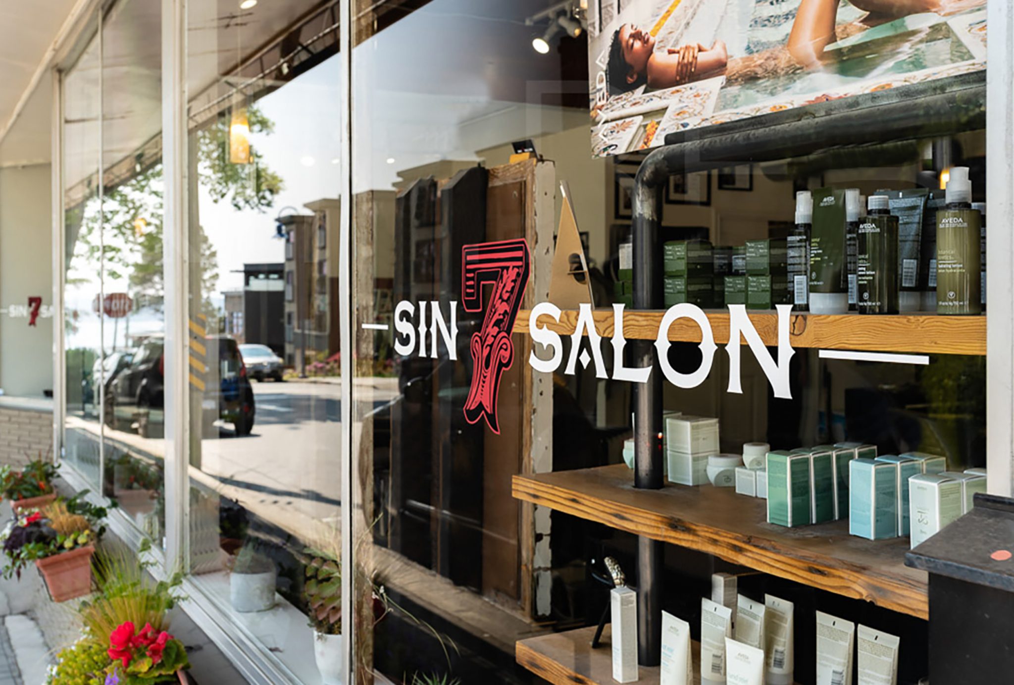
To create a logo that aligned with Sin 7’s interior design and personality and also established them as a brand that stood out, we selected a vibrant red and gold to contrast against a stylish black. This colour scheme would provoke interest while coinciding with the trendy art deco and moody gothic styles reminiscent of the Sin 7 personality.
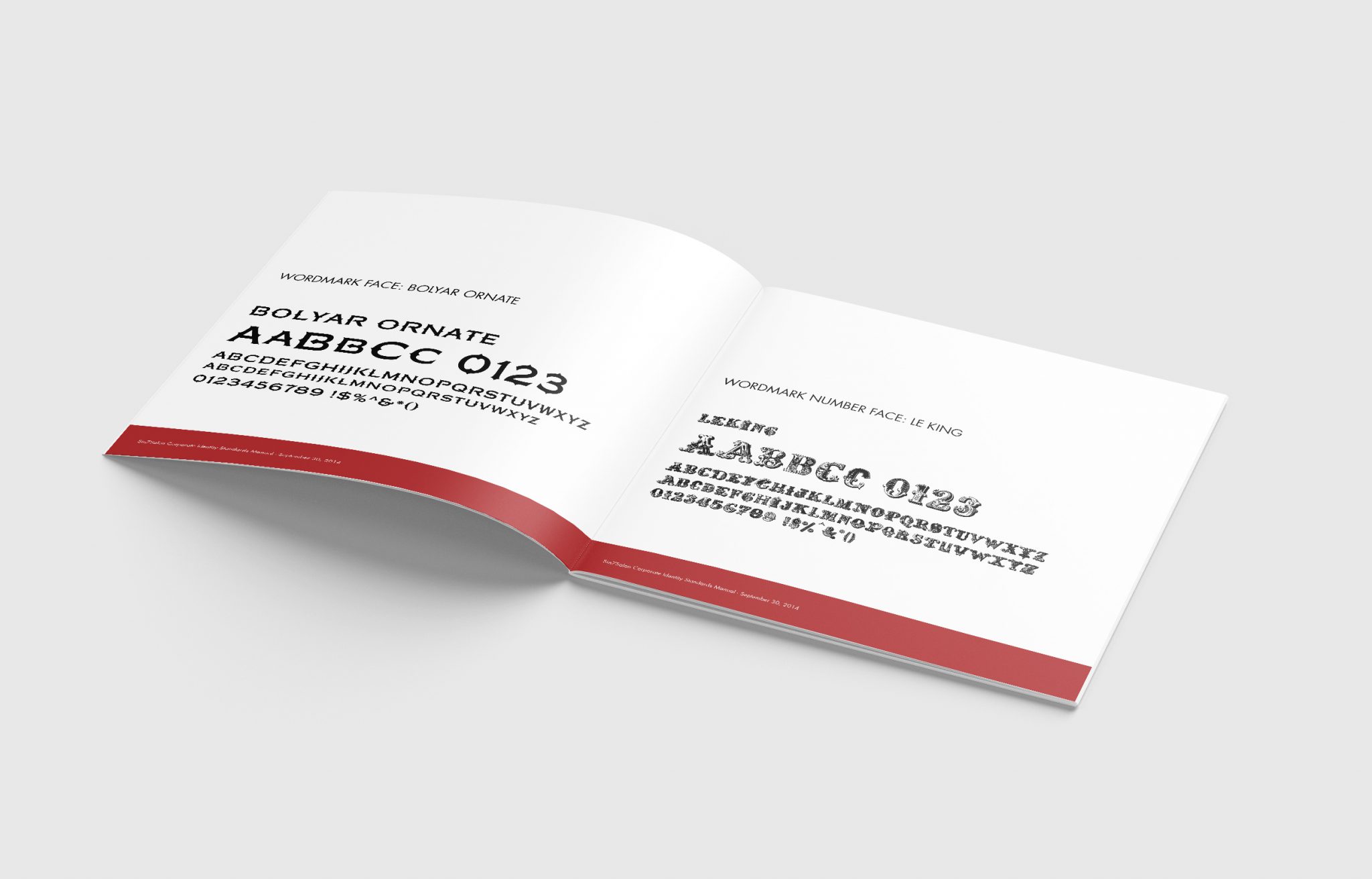
Combining this colour scheme within the logo allowed us to steer it away from the overly floral designs of other salons. We also sprinkled hints of tradition with enthusiastic contemporary fonts, which attract the eye and keep it there. Along with the font styles, livery pattern, and vintage brochure designs, the Sin 7 Salon brand has a one-of-a-kind aesthetic among other local salons. The best part? They have an instantly recognizable image that captures attention, engages prospects, increases business, and helps to fuel new growth for years to come.